
Design system
Buyapowa , B2B2C, SaaS
Led the evolution of an in-house design system to implement UI & UX best practices, consistent branding, responsive layouts and WCAG 2.0 AA compliance with shared components
Overview
When I first joined Buyapowa, it was clear that the company was in dire need of a fresh design system. The existing setup lacked cohesion, with components scattered and no clear alignment in sight.
This lack of consistency led to a myriad of inconsistencies across the platform, making it challenging for users to navigate and interact seamlessly.
This is a summarised version of the project, reach out if you'd like to know the full story.
Team
As a member of the Product Team, I reported to the Product Director and worked closely with another senior designer during their tenure.
This collaborative environment allowed us to pool our expertise and insights, contributing to the development and implementation of a robust design system that would improve the user experience and elevate the platform interface.
Solution
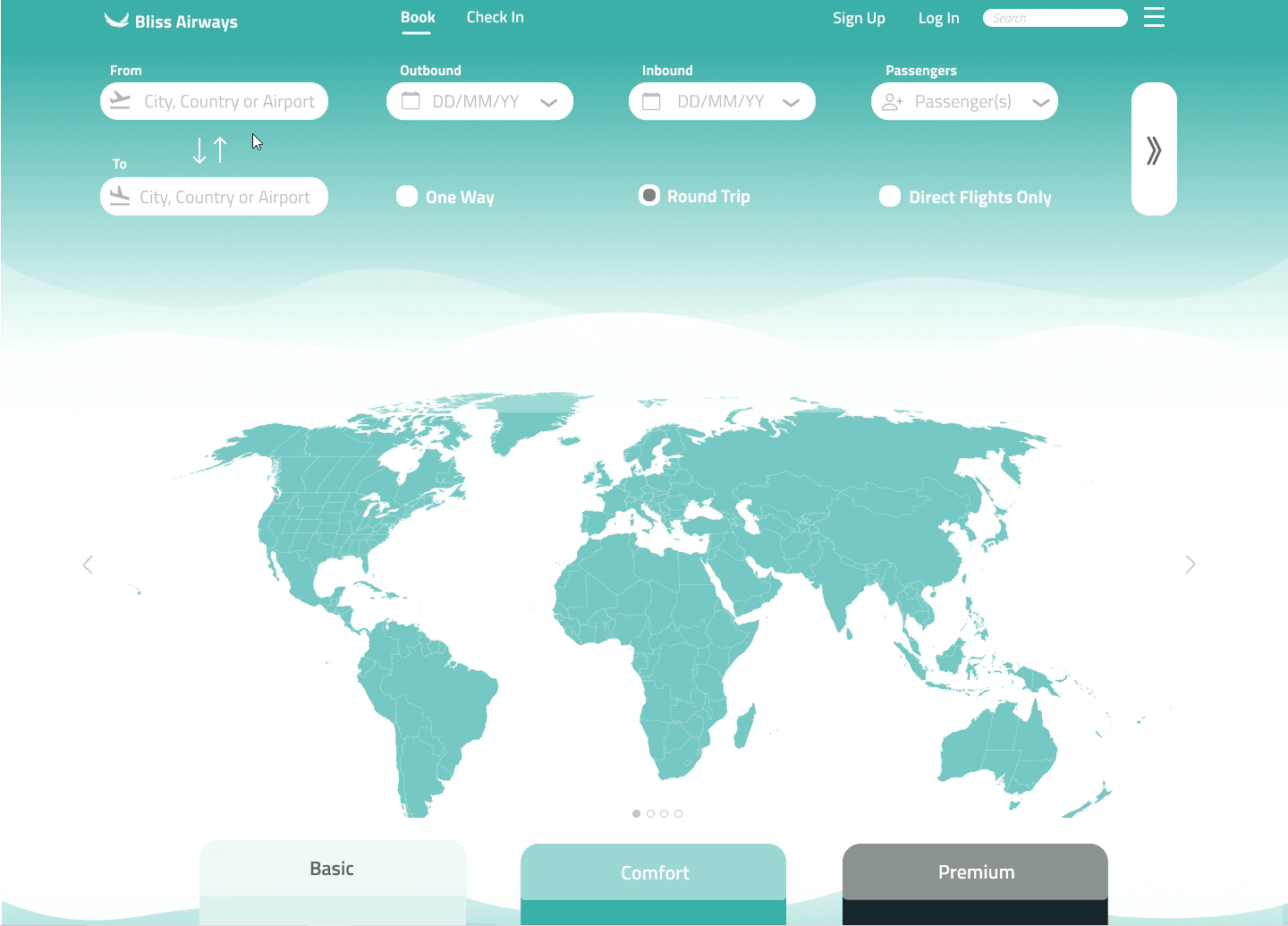
Developed a robust Design System to solidify brand identity, maintain consistency, and deliver a seamless user experience for leading brands such as HSBC, Vodafone, and Red Bull in managing their referral campaigns.
Audit
The initial move was to dive into an audit of the Figma file structure, components, and developer documentation. I took a comprehensive approach, listing all component instances like buttons, input fields, and typography. Additionally, I conducted a comparative analysis with the live customer portal to ensure alignment and identify areas for improvement according to best practices in UX auditing.
Key findings
It became evident from the beginning that the Design System resembled more of a dispersed pattern library within Figma and engineers lacked proper documentation or usage guidelines. It was clear that the pattern library suffered from fragmentation, inconsistency, and outdated elements.
As a result, the product team faced challenges with a lack of cohesive design language, guidelines, and UI pattern libraries. This disorganization resulted in inefficiencies within the team and noticeable inconsistencies across the product, underscoring the urgent need for a streamlined and unified approach to managing the design system.
Fragmented pattern library
The master components were dispersed across various files instead of being centralized in a unified library. Certain components, dating back several years in Sketch, were unfortunately lost during the transition to Figma. As a result, many components became irretrievable, rendering any attempts at editing them impossible.
Outdated components
Due to their antiquity, numerous components were not benefiting from the latest technological advancements. Figma offers a range of features that bridge the gap between design and development, such as Auto Layout, variables, and instances, yet none of these were being utilized.
Buttons
Documentation defficiency
The components were not only undocumented but also constructed without a design system in mind which made them unreliable and untraceable. They were devoid of any accompanying documentation or usage guidelines for engineers. This absence left much open to interpretation, leading to irregular spacing between components, varied border radii, and inconsistent hover and negative states across the platform.
Lack of WCAG compliance
During the component audit, it became evident that accessibility was not prioritized during their development. Several issues arose regarding legibility, colour, contrast, and inconsistency, particularly concerning core components like primary call-to-action elements.

Crafting the Design System
Given the multitude of inconsistencies and outdated components, utilizing the existing pattern library as a foundation for the new Design System seemed impractical. A decision was made to initiate an entirely fresh system, leveraging the latest Figma technologies and structuring it based on Atlassian’s Design System.
The documentation was kept straightforward as Buyapowa's requirements are considerably smaller than Atlassian's. Transitioning from scattered components and lacking documentation to a unified source of truth with basic documentation represented a significant leap forward, striking the right balance of effort for the team.
Fundamental
principles
The process began by defining the new fundamental principles based on the existing ones – encompassing colours, typography, spacing, iconography, elevation, and border radius. All other elements were to be developed upon these fundamental building blocks.
Considering the simplicity of the portal, the fundamental principles were kept minimal. There was an expansion of the current colour scheme to address previously unmet use cases. Additionally, a wider range of typography options was introduced to enhance flexibility in component creation.
Colour pallete
The colour enhancement initiative commenced by examining the existing colours utilized throughout the product and subsequently broadening the palette. Throughout the process, a steadfast emphasis was placed on accessibility, ensuring that each colour adhered to AA accessibility standards, with either black or white as a contrast.

Typography enhancements
The colour enhancement initiative commenced by examining the existing colours utilized throughout the product and subsequently broadening the palette. Throughout the process, a steadfast emphasis was placed on accessibility, ensuring that each colour adhered to AA accessibility standards, with either black or white as a contrast.

Grids & spacing optimization
The spacing system aims to deliver a seamless experience for the end user, establishing a framework for responsive design and customizable UI density. A fundamental objective was to establish a base unit that guarantees visual consistency, leading to the adoption of an 8px unit, previously proven effective.

Visual hierarchy
A progressive elevation system was sought to enable designers to convey depth effectively. Elevation serves as a means to direct focus and signify hierarchy within the design. Heavy shadows were specifically reserved for components requiring heightened attention, like modals and drawers, thereby restricting their usage and maintaining subtle elevation across the remainder of the application.

Components development
After establishing the fundamental principles, a comprehensive audit of all existing components utilized across the product, along with additional missing ones, was compiled. The process of building these components involved complete overhauls for some and maintaining the status quo for others as per the old pattern library. The entire set of components were built using Auto Layout, variables, and instances.
Documentation was crafted for each component, tailored to the complexity of the design, serving as a resource for engineers during the build phase and for inclusion in the eventual release of the comprehensive Design System.
Toasters
Toasters are employed to present prominent messages located at the bottom right of the screen. These are customizable, enabling the display of icons on the left side, and the capability to switch between different states, including default, warning, danger, and success.

.png)
Dropdowns
The portal extensively utilized dropdown menus, necessitating their adaptability. Through the Design panel, dropdown menus could be easily customized with icons, checkboxes, and toggled between different states, all integrated within the component itself.

Buttons
Throughout the portal, a multitude of button variations were identified. To align with best practices, we've consolidated these into primary and secondary options, each available in large and small sizes, alongside a tertiary text link button. Utilizing the Design panel, all buttons have been enhanced for maximum customizability, enabling adjustments to their states, addition of icons, and resizing as necessary.

Input fields
Input fields consistently demand the management of numerous permutations within a single component. Extensive utilization of atoms has been employed to construct organisms, promoting consistency and simplifying the build process. With the new system, transitioning from one input field to another is effortless for designers, requiring only a few clicks without the necessity of adjusting or detaching from the main component.

Suite of components
Naturally, the aforementioned components represent just a selection of the wide-ranging array included in the system. In addition to those listed, labels, avatars, checkboxes, navigation elements, date pickers, pagination controls, tabs, toggles, tooltips, and toasts - each complemented by thorough documentation - were developed as essential components within this initiative.
Outcome
The adoption of a fresh Design System facilitated accelerated workflows and promoted uniformity within the team's projects. Expanding upon this initiative, the product team aims to integrate these components into Storybook, transitioning towards a comprehensive Design System where Figma components seamlessly align with the codebase.
Establishing robust foundational elements not only fosters system evolution but also provides a framework for scalability and adaptability, ultimately enhancing overall efficiency and productivity.
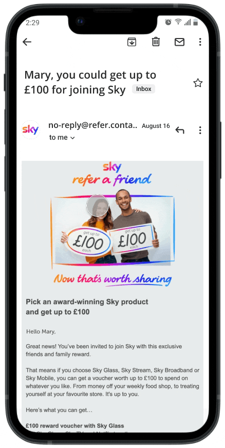
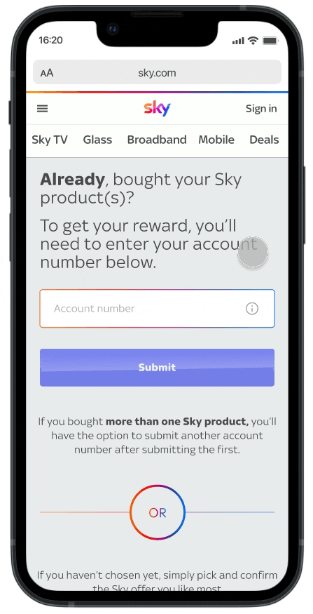
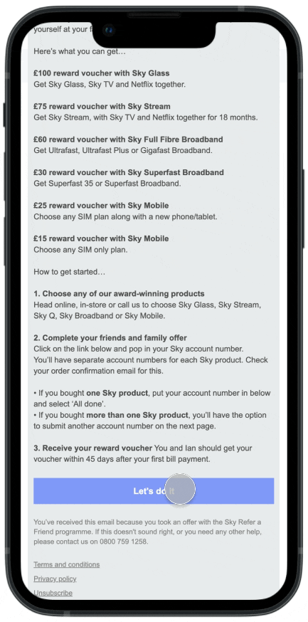
Sky rewards
Buyapowa (B2B2C, SaaS)
Revamped Sky's referral journey and increased customer retention by 33%.
Optimised the registration process and improved conversion rates for redeeming rewards across Sky products, including Sky Glass, Sky Broadband, and Sky Mobile.
Get in touch for access
*This private case study can be shown in interviews.