Rebuilt the reward fulfilment experience, surfacing tracking of reward redemption to customers.
Self-serving this allowed independent investigations of user queries, decreasing support tickets by 20%.
Listen to narrated case study
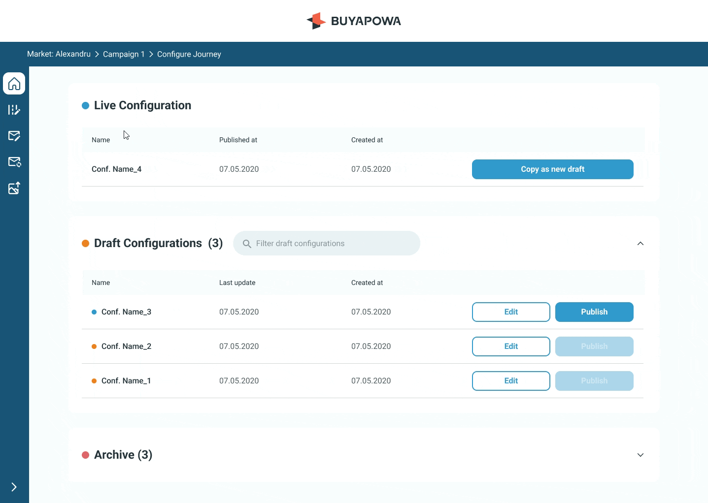
Reward fulfilment
Buyapowa - Referral marketing / B2B2C SaaS
Problem
Clients reported missing rewards, causing frustration and poor user experience. The lack of visibility led to confusion, as referrals succeeded but rewards didn't. This increased the workload for Customer Support and Finance, who had to track and share updates manually.
Solution
The design solution aimed to give clients clear visibility into their rewards, reducing reliance on CS and Finance teams. This improved tracking of reward statuses, allowing clients to manage referrals from start to finish.
Impact
CS and Finance workload down 50%—streamlined workflows, simpler reporting.
Customer support tickets down 20%—key info enabled self-service.
Reward tracking up 40%—enabled clients to track end users' referrals to completion
Discovery
In the early discovery phase, I collaborated closely with the CS team to gain deeper insights into the factors contributing to reward delivery issues to end users. Through thorough examination of numerous customer support feedback reports, I identified the following recurring patterns associated with failed rewards:
Reward on hold
Payout declined
Reward provider has contacted the user because they don’t have an account or there is something wrong with their account.
Reward provider has determined that the payout should be declined as it does not meet their risk criteria.
Unclaimed reward
The user has failed to claim the payout within 30 days of it being issued.
Failed fulfilment
Technical error - unknown technical error meant the fulfilment failed.
Unknown reasons
A limited number of transactions failed for no apparent reason and the reward provider should contact the user.
Receiver country not allowed
The user is in a country where payouts aren’t supported.
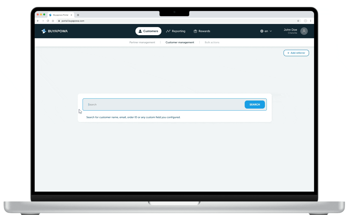
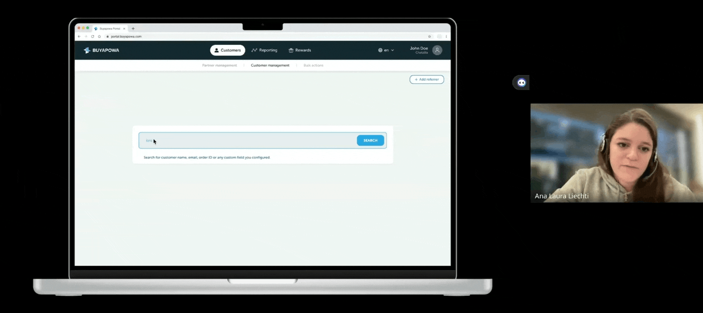
UX audit
Following the collection of feedback from our end users, my next steps involved conducting an audit of our platform's (Portal) reward fulfillment functionality to get a better understanding of its capabilities.
The audit revealed that the Portal's UX fell short in enabling users to effectively track a reward fulfilment and identified areas for improvements. Users needed to be able to intuitively grasp how a referral leads to a reward or fulfilment, and access both real-time and historical status updates.

The legacy design of the Portal which my team inherited
(all user details are fictitious, ensuring compliance with GDPR regulations.)
Research findings
Upon consolidating my research findings from the CS reports with the outcome of the UX audit, it became clear that for a user to autonomously navigate a reward fulfilment, they required access to a combination of the following data points:
Reward types
Time of fulfilment
Reward types are not clearly labelled and not standardized for recognition rather than recall.
The time of the fulfilment is not displayed so when two fulfilments happen on the same day it is impossible to determine which fulfilment relates to which referral.
Identifiers
Missing key identifiers makes it difficult and sometimes impossible for clients to cross-reference a fulfilment back to a referral.
Reward value
Missing reward value makes is harder for the Finance team to put together reports and offer accurate financial reports.
Status history
The status of the fulfilment is not updated in real time and offers no historical data of the fulfilment processs.
Terminology
Clear terminology, consistency and standards required across the platform. Users shouldn't wonder whether different words mean the same thing.
Data integrations
In order for the user to be able to trace a the status of a reward, data surfacing and third party intergrations are required.
Retry functionality
Retry functionality is not available for all reward types so users are unable to self-serve. Consequently, this leads to an increase workload to the CS team.
Error details
Error details are not displayed so users can't self-serve and leaves them uninformed.
Analysis
During the analysis phase, I led a collaborative workshop with the product team to brainstorm potential use cases tailored to key user roles such as Marketing Executives, Customer Service Representatives, Data Analysts, Operations, and Finance users.
The use cases served as detailed descriptions of how users would interact with the platform, outlining their goals and the steps required to achieve them. I then utilized a prioritisation matrix to assess the frequency and impact of each use case, ranging from sporadic occurrences affecting a few users to persistent challenges affecting all users.

Use cases

People
Time
Prioritisation matrix
Information Architecture (IA)
Informed by the behaviours of our users, I then focused my attention on creating an Information Architecture (IA) map to understand how users, content, and context are interconnected. This involved organizing, structuring, and labeling content effectively to help users easily find information and complete tasks.
The IA map also addressed the visual hierarchy of information, by breaking it into primary, secondary, tertiary, data integration and hidden for future developments. This ensured an optimal user experience by facilitating intuitive navigation and served as a comprehensive blueprint for the platform's architecture, aligning with our user expectations and business objectives.

IA map
Design
After analysing the combined research data and extracting key insights from the workshop and IA map, it was time to carry some low fidelity ideation to bring these concepts to life. The initial sketches explored the relationship between data surfacing and visual hierarchy followed by more high fidelity designs.
Low fidelity ideation

Low fidelity ideation
High fidelity designs
During refinement and iterations of designs, I worked closely with the Customer Support (CS) team and engineers to ensure alignment with stakeholder requirements and user needs.
This ensured that the design not only aligned with technical capabilities but also met the team's constraints, resulting in a high-fidelity design used for prototyping and usability testing.

High fidelity design
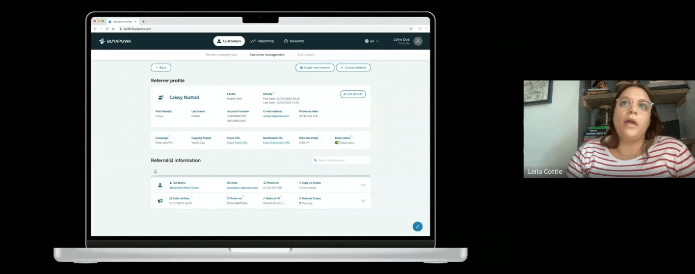
Prototype
This hi-fidelity prototype explores a successful referral and reward fulfillment user flow.
Clients now have access to a detailed Referral History Log and Reward Fulfilment Log which enables them to track and manage their end users’ rewards effectively.
Testing
Usability testing provided a valuable opportunity to validate and refine our design hypotheses. Users praised the clarity and visual hierarchy in surfacing data, recognizing the effectiveness and intuitiveness of the new design, particularly when accessing reward fulfilment statuses.
However, concerns were raised regarding naming conventions and the need to address bulk actions functionality for future iterations.
Usability testing in progress
Usability testing in progress
Feedback analysis
The usability testing feedback analysis provided a clearer understanding of users' key pain points and mental models, which formed the basis for a prioritisation matrix.
The findings indicated that the top short-term priorities for our users were improving terminology, iconography, and search functionality while filters and bulk actions features were considered lower priority and scheduled for future iterations.

Reflection
During this project, I had the privilege of working with a talented team and gained valuable insights into scaling design within an organization with competing priorities. I also learned the importance of cross-collaboration in creating a successful product and the value of working closely with engineers.
Futhermore, I discovered that encountering resistance at times it doesn’t mean failure but it often indicates progress and by involving the entire team in the design process, it deepened my appreciation for the impact of my work.

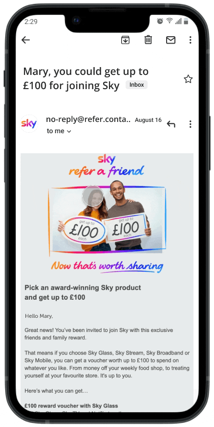
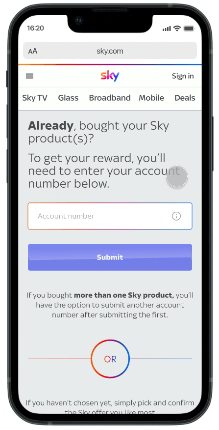
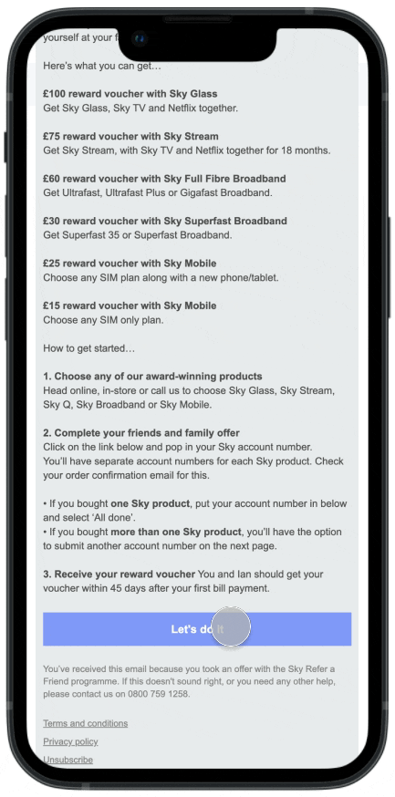
Sky rewards
Buyapowa (B2B2C, SaaS)
Revamped Sky's referral journey and increased customer retention by 33%.
Optimised the registration process and improved conversion rates for redeeming rewards across Sky products, including Sky Glass, Sky Broadband, and Sky Mobile.
Get in touch for access
*This private case study can be shown in interviews.