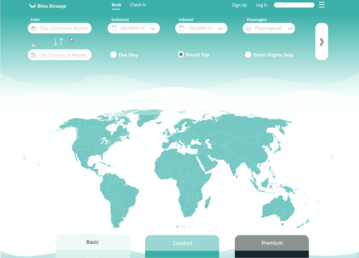

Bliss Airways
Freelance, Airline booking provider, B2C
Streamlined flight booking experiences by eliminating third-party intermediaries and reducing steps to book. Ensured clarity and accessibility, resulting in a 30% increase in conversion rates.
Listen to narrated case study
Overview
At the heart of the Bliss Airways project lay a set of core design principles: efficiency, simplicity, accessibility, and desirability. The primary objective was to revolutionize the flight booking experience by eliminating third-party intermediaries, streamlining processes, and ensuring clarity and accessibility every step of the way.
Throughout the project's lifecycle, from its initial conceptualization to the phases of research, design, and testing, these principles remained central, guiding every decision and iteration.
Efficiency
Simplicity
Accessibility
Desirability
Team
At Bliss Airways, I joined as a contractor, and in my role as the sole product designer (UX/UI), I collaborated closely with the founder and a full-stack engineer.
Research
During the research phase, the objective was to grasp user behaviors during flight ticket booking.
This facilitated the identification of key pain points and areas for improvement.
Online survey
Usability tests
Competitive benchmarking
Online survey
The objectives of the online survey was to learn more about the goals of people that use airline websites - what are they trying to do, what is preventing them from doing it and what else would they like to be able to do


Competitive benchmarking
As well as testing both desktop and mobile flight booking websites with users, I looked into other hospitality industries to see how they were dealing with the issues that some users have raised.
There were both similarities and differences between airlines in the same industry and it provided a lot of food for thought as well as taking into consideration the standard mental model that has developed for users in the industry.


Usability testing
Usability testing has provided valuable research data to inform the design. After preparing a screener and test script, I conducted usability testing on two competitors' platforms to understand their strengths and weaknesses and how these insights could benefit the development of Bliss Airways.
This feedback highlighted positive aspects and pain points, such as the overwhelming number of ads and the excessive steps required during the flight booking process.


Analysis
During the analysis phase, the focus was on organising the qualitative and quantitative data that was gathered previously and identify recurring patterns that would inform the design process.
Affinity diagram
Customer journey map
Affinity diagram
The affinity diagram surfaced valuable information regarding user goals such as saving time when booking a flight ticket and identified relevant pain points in the process relating to terminology or unnecessary ads.


Customer journey map
Building on users' mental models, pain points, and goals, the customer journey map added structure to the research data.
This helped to empathise with the user during each stage of the booking process and enabled me to understand their interactions comprehensively, identify opportunities for improvement and optimise the customer experience.

Design
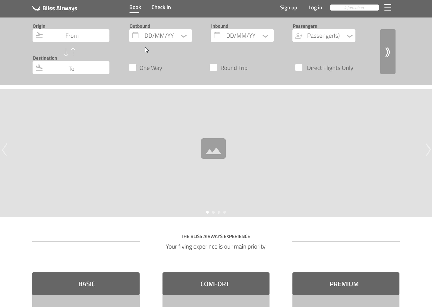
During the design phase, the main focus was to streamline the flight booking process. The optimised user journey informed the concept designs, which were then followed by a medium-fidelity prototype to convey the primary screen states, basic components, and navigation structure.
Flow diagram
Low-fidelity sketches
Medium fidelity prototype
Flow diagram
In developing the flow diagram, my aim was to enhance the standard flight booking experience by reducing the number of steps required to book a ticket and eliminating user distractions.

Low-fidelity sketches
As the ideation phase commenced, I started with low-fidelity sketching to explore and refine solutions for the identified challenges.
These sketches on paper allowed for rapid iteration and adjustment, aiming to distill effective solutions through a process of trial and error.


Medium fidelity prototype
Try some buttons!
Outcome
The hi-fidelity prototype sums up all the information documented and tested previously, so that it would provide an enhanced user experience during the booking process.
Hi-fidelity prototype
Screen shots
Wireframes
Hi-fidelity prototype
Wireframes
With the high fidelity screens mapped into a fully functional prototype, my final objective was to develop descriptive wireframes of each screen with details to aid potential developers to build the product more accurately.
This final stage allowed me the opportunity to double check my work through every detail and to find an effective way of communicating each detail to whoever may be reading.
Screen shots


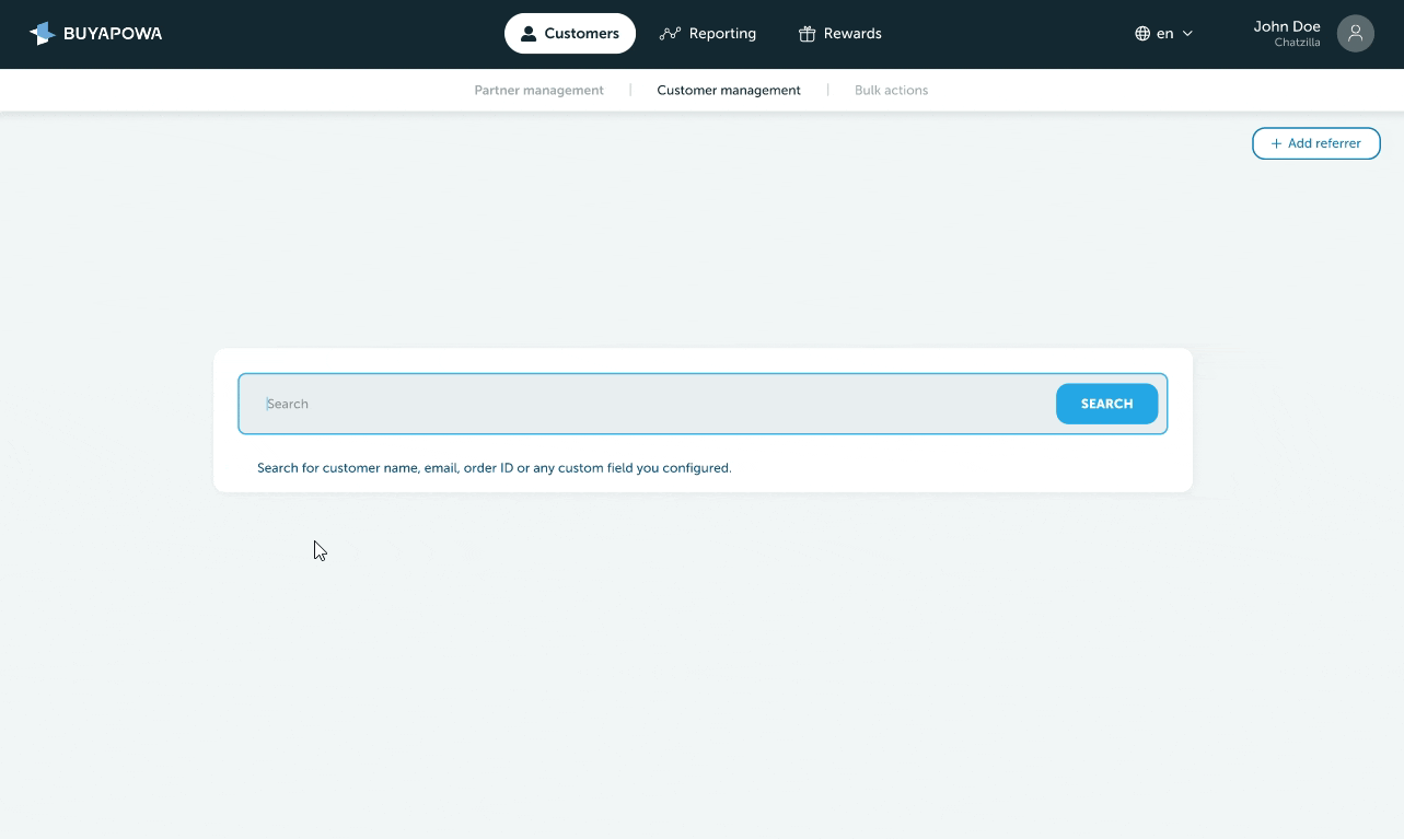
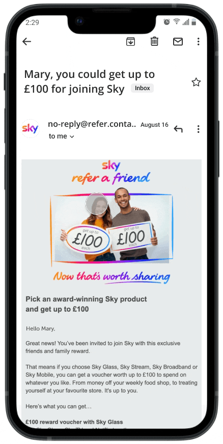
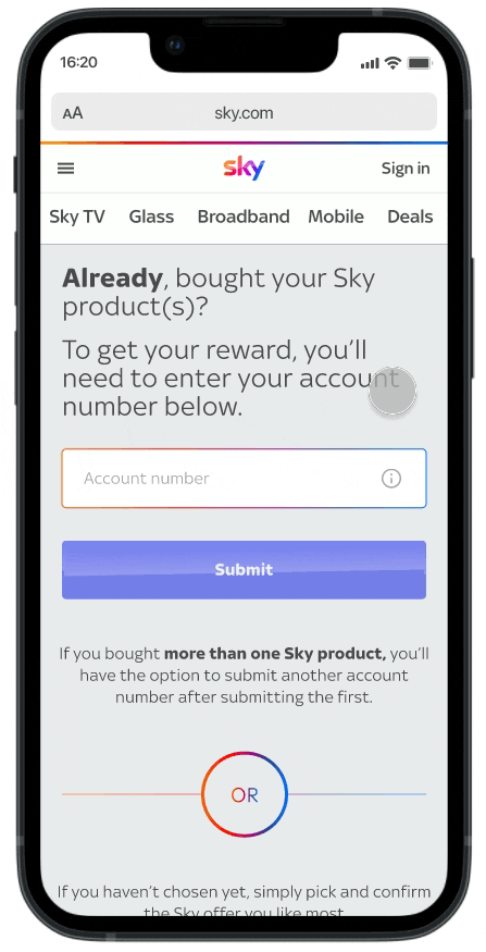
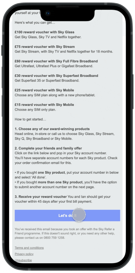
Sky rewards
Buyapowa (B2B2C, SaaS)
Revamped Sky's referral journey and increased customer retention by 33%.
Optimised the registration process and improved conversion rates for redeeming rewards across Sky products, including Sky Glass, Sky Broadband, and Sky Mobile.
Get in touch for access
*This private case study can be shown in interviews.